How to Make Your Images Stand Out Online
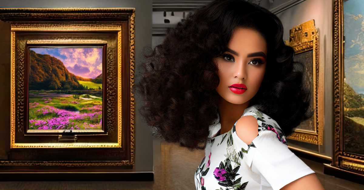
In today’s digital age, having high-quality images on your website or social media platforms is more important than ever. With so much competition, it can be difficult to make your images stand out online. However, with a few art and design tips, you can create visually striking images that capture the attention of your audience. Here are some ideas on how to make your images pop from an art and design perspective.

1. Choose the Right Colours:
One of the most important elements of any image is its colour palette. Choose colours that complement each other and create a cohesive look. Use tools like Adobe Color or Color Hunt to find colour schemes that work well together. Consider the mood you want to convey with your image and choose colours that reflect that mood. Bright, bold colors can create a sense of excitement and energy, while muted, pastel colors can create a calming and peaceful vibe.
2. Use Composition
Likewise, the composition of your image is another important aspect to consider. The rule of thirds is a composition technique that divides an image into three equal parts vertically and horizontally, resulting in nine equal parts overall. By placing the subject or focal point in one of the intersecting points, you create a more balanced and dynamic image. This helps to draw the viewer’s eye towards the subject, making it stand out among other online content. CareerFoundery has a great in depth guide on how to use the rule of thirds in design.
3. Add Texture
In addition to colour and composition, adding texture to your images can make them standout online by creating visual interest and depth. Texture can add a tactile element to your photographs or graphics, making them more engaging and memorable. It can also help convey a mood or tone, and create a feeling of depth or dimensionality. Textures can be added through filters or overlays, or by using textured backgrounds, such as wood or paper. Overall, adding texture can enhance the visual impact of your images, making them more noticeable and memorable online.
4. Consider Typography
Furthermore, if your image includes text, pay attention to the typography. Using typography effectively involves selecting the right font that complements your message, using contrasting colors, keeping it simple, creating visual hierarchy with font size and weight, and establishing balance in the design by arranging text elements in an uncluttered manner with enough white space to make it easy to read. By following these tips, you can enhance the appearance and impact of your images that contain text.
5. Use Lighting
Moreover, the use of lighting in design can significantly enhance the overall quality and appeal of your images online. By using appropriate lighting techniques, you can create a mood, highlight specific elements, and add depth to your design. For example, soft lighting can enhance the beauty of a product image or portrait, while dramatic lighting can create a sense of tension or intrigue. Canva has some great tips on how to use lighting effectively without overdoing it.
6. Be Unique
Finally, the most important thing you can do to make your images stand out online is to be unique. To “think outside the box” when designing images, you should brainstorm as many ideas as possible, experiment with new tools and techniques, consider different perspectives, break the rules of design conventions, and connect seemingly unrelated ideas. By applying these methods to your design process, you can come up with innovative and creative ideas that will make your images stand out online.
Using Art and Design Techniques in Your Posts

In conclusion, making your images stand out online from an art and design perspective requires equally important attention to detail and creativity. By choosing the right colors, using composition, adding texture, considering typography, using lighting, and being unique, you can create visually striking images that capture the attention of your audience. Whether you’re a professional artist, designer or a social media influencer, these tips can help you create images that are both beautiful and effective.
What are some of the most effective techniques you have used to make your images stand out and grab attention online? Let me know in the comments below!


0 Comments