Home > Blog > Reviews > Rebelle Painting Software Series > Rebelle’s Pigments and Why Surface Matters

How Pigments Work in Rebelle—and Why the Surface Matters
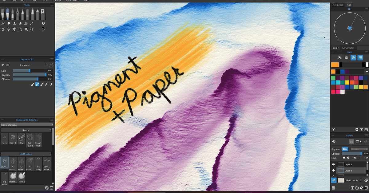
Screenshot of a digital painting application showing a canvas with a watercolour-style painting. The artwork features broad strokes of blue, purple, and orange, with the words "Pigment + Paper" handwritten in black over the orange section. The interface includes various brush tools on the left, colour palettes and layers panel on the right, and brush customization options in the center-left. The canvas has a textured, paper-like appearance.
A closeup of the Hot Pressed paper type to demonstrate how some of the tools work with art surfaces in Rebelle. I used the watercolour brush, water brush and tilt control for the blue and purple. The orange is done with the express oils brush and the handwriting is done with the pencil tool.

Get ready to paint like never before—Rebelle’s pigment and surface system brings a new level of realism to digital art.

This post contains an affiliate link. If you decide to purchase Rebelle using my link, I’ll earn a small commission at no extra cost to you. It helps support my website and keeps posts like this coming. Thanks for your support if you decide to use it!

Try Rebelle hereFrom April 1–30, 2025, you can save 30% on Rebelle painting software, upgrades, and art surfaces during their Bloom with Art promotion.

Get ready to paint like never before—Rebelle’s pigment and surface system brings a new level of realism to digital art.

One of the things that sets Rebelle apart from other digital painting software is how it simulates real pigment behavior. Instead of just laying down digital colour, Rebelle mimics how actual paint would mix, spread, and interact with different surfaces. It’s this realism that makes it such a powerful tool for digital artists who want to capture the feel of traditional painting.

Pigments in Rebelle: More Than Just Colour

In Rebelle, colours are made of virtual pigments, and just like traditional media, they don’t simply blend by averaging two colours. Instead, they interact based on pigment load, transparency, water content, and staining properties.

  • Wet-on-wet painting: The pigment will spread, pool, or bloom depending on how wet the canvas is and how much water is in your brush.

  • Layering colour: Rebelle keeps track of opacity and pigment concentration, so you can build depth and glazing effects.

  • Mixing colours: Instead of automatic blends, pigments mix based on how they would behave in the real world—producing more natural, often unexpected results.

It’s a system that encourages exploration, because no two brushstrokes behave exactly the same.

Art Surfaces: The Hidden Hero of Your Painting

Rebelle gives you a variety of realistic art surfaces—from cold press watercolour paper to canvas to handmade textures. Each one affects how your pigments move and absorb.

Here’s why surfaces matter:

  • Tooth and Texture: Papers with more tooth will grab pigment differently than smoother surfaces. You’ll see more grain and subtle breaks in the stroke, just like you would with dry brush on rough paper.

  • Absorption Rate: Some papers absorb water and pigment faster, which shortens the time your paint can flow or blend. Others allow more time for wet techniques.

  • Surface Interaction: The way paint spreads, edges form, and blending happens all depend on how the surface interacts with water and pigment—something Rebelle simulates in real-time.

Pro Tip: Custom Surfaces
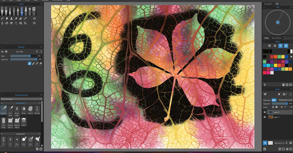
Screenshot of a digital painting software interface displaying a colourful abstract artwork. The image shows a detailed, close-up view of a skeletonized leaf texture with a black shape and a swirling doodle overlaid. The leaf structure is filled with vibrant gradients of green, yellow, orange, and red. On the left, tool and brush settings for "Pastels" are visible, while the right side includes colour palettes, layers, and a navigator. The central artwork blends organic textures with digital effects.
I created a custom tileable leaf texture to use as an experimental art surface. The fall colours within the leaf vein structure was done with the watercolour brush, water brush and tilt control. The chestnut leaf is a stencil and the black “rubbing” was done with the pastel tool.

You can even import or create custom papers and canvases with your own textures. This adds an extra layer of control and creativity, especially if you want your work to look like it’s been painted on handmade or experimental surfaces. The papers are tileable so make sure your custom surfaces are seamless patterns for a consistent look. Alternatively, you can match the pixel dimensions of your custom paper with the same dimensions you want your painting to be in Rebelle.

Why It All Matters

Together, the pigment system and paper engine in Rebelle recreate the tactile unpredictability that traditional artists love. It’s not just about looking real—it feels real while you paint. And that makes for a more immersive, intuitive, and expressive experience.

Whether you’re a watercolor purist, an oil painter, or a mixed media enthusiast, Rebelle gives you the tools to work with the medium, not just on top of a flat screen.

Want to try it for yourself?

Download Rebelle here – and don’t forget: from April 1–30, 2025, you can save 30% during their Bloom with Art sale on the software, upgrades, and surfaces.

Let me know if you have questions or want help exploring the tools—I’ll have more posts coming in the future on how to use Rebelle’s advanced features to their full potential.
More From Art and Design By Teresa Cowley
This is an image of a stylized travel poster displayed on a wall. The poster features layered mountain landscapes with varying shades of blue and green, and an orange and yellow sun setting or rising in the background. At the bottom, there's a small red structure that resembles a traditional Asian pagoda. The poster has a retro minimalist design aesthetic with the title "TRAVEL" at the top in large, bold lettering. The poster is framed and hung on a blue wall, flanked on the left by a tall, dark vase with dried reeds and on the right by a potted plant with broad green leaves resting on a stack of hardcover books. The colours and composition suggest a serene and inviting scene.
Minimalism in Design: Less Is More
Dive into the world of minimalism in graphic design, where less is truly more. Uncover how embracing...
This image features a woman in a blue shirt, with her hands pressed against her cheeks, and her mouth wide open in an exaggerated expression of shock. She has brown hair styled into two buns on either side of her head, and her forehead is creased, emphasizing her expression. Behind her is a purple wall with four framed abstract paintings featuring swirling patterns in shades of blue, black and white. behind her, there is a white loveseat sofa with purple pillows and a small, modern black table with a purple vase holding lavender flowers to the right. The flooring is light-coloured, and the overall colour scheme of the room is coordinated with purples and blues.
The Website Snafu: A Close Call
Ever wonder what keeps a website from crashing into chaos? Dive into my story as I navigate the treacherous...
Yes, Digital Art Is Real Art
Digital art is every bit as real as traditional art. From mastering color, light, and texture to building...

Digital artist and graphic designer, Teresa Cowley

My name is Teresa Cowley, and I'm a digital artist and graphic designer from Vancouver Island, Canada. I focus on abstract and fantasy art as well as digital collage, and like to utilize AI art tools as part of my design process to create new, innovative pieces of art. I strive to create new, unique designs that tell imaginative stories, and I am eager to push the boundaries of what can be expressed with art and technology.

0 Comments

Leave a Reply

Avatar placeholder

Your email address will not be published. Required fields are marked *