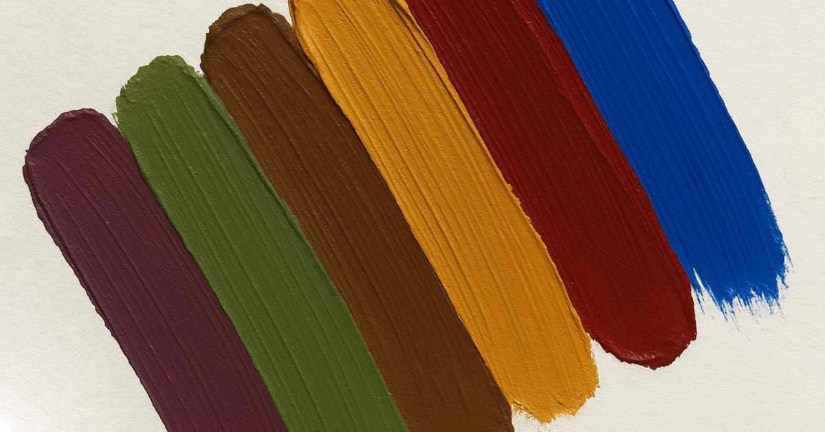
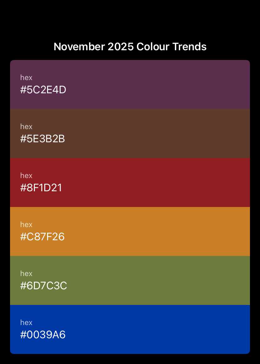
November 2025 Colour Trends: Fresh Inspiration for Artists & Designers
As autumn deepens and winter approaches, November’s palette blends warmth, depth, and clarity. This month’s trending hues are all about emotional expression and grounding energy — ideal for both traditional and digital creatives. It’s a month of rich contrast.
According to Elle Decor, Harper’s Bazaar, and Living Etc, November’s direction emphasizes a balance between bold blues, moody reds, and natural earth tones. Though there are some similarities to the October colour trends, there are some differences. Each month has it’s own colour story and it’s fascinating to see the constant evolution.
1. Ultra Azure — Clarity and Focus
A vivid, confident blue that commands attention without overpowering a piece. It’s both energizing and serene — perfect for adding balance to warm compositions.
Try it:
As a background for digital compositions
Highlight or focal accent in mixed media
Symbolic colour for renewal and creative clarity
Creative prompt: Create a piece inspired by the word “focus.”
2. Currant & Plum — Emotion and Story
Deep reds and purples bring warmth and narrative depth to November’s palette. They feel introspective and dramatic, ideal for creating mood and movement.
Try it:
In layered brushwork or transparent glazes
As a digital gradient blending into deep neutrals
To evoke themes of transformation or nostalgia
Creative prompt: Express the emotion of “late autumn” through colour. It’s not about what you see, but how it makes you feel.
3. Amber & Mocha — Warm Neutrals
Amber and mocha provide the quiet heart of this palette — natural, tactile, and cozy. They balance cooler hues while adding dimension and visual warmth.
Try it:
For soft backgrounds or neutral spaces in design
As a way to anchor vivid blues or reds
In textures suggesting light, fabric, or woodgrain
Creative prompt: Reimagine one of your older works using warm, earthy tones.
4. Olive & Earthy Greens — Natural Calm
Earthy greens such as olive, sage, and moss connect us to nature’s stillness. They work beautifully in contrast with jewel tones or as subtle grounding layers.
Try it:
As a background or tonal wash for organic balance
In eco-inspired or minimalist compositions
With amber or currant for a warm, contemporary feel
Creative prompt: Create a small piece (or your preferred size) exploring “stillness in nature.”
Suggested November 2025 Palette
Now that we’ve explored November’s standout shades, here’s a quick reference palette you can use in your own creative work — whether you’re mixing pigments in the studio or building digital colour layers on screen. These hues balance emotion and clarity, warmth and calm, perfectly capturing the spirit of the season.
Ultra Azure (#0039A6)
A vivid, confident blue symbolizing clarity and focus.
Traditional equivalent: Phthalo Blue (PB15:3) — perfect for cool glazes, highlights, and digital accents.Currant Red (#8F1D21)
A deep, dramatic wine red that adds emotional depth.
Traditional equivalent: Alizarin Crimson (PR83) or Quinacridone Magenta (PR122) — ideal for layering and transparent effects.Plum Purple (#5C2E4D)
A moody violet that evokes mystery and introspection.
Traditional equivalent: Dioxazine Violet (PV23) — excellent for rich shadows and blending into reds or blues.Amber Gold (#C87F26)
A glowing midtone that brings warmth and harmony.
Traditional equivalent: Burnt Sienna (PBr7) mixed with Cadmium Yellow (PY35). Great for highlights or luminous backgrounds.Mocha Brown (#5E3B2B)
A classic neutral that anchors the palette with quiet strength.
Traditional equivalent: Burnt Umber (PBr7) — versatile for shading, texture, or balancing bolder hues.Olive Green (#6D7C3C)
A calm, nature-inspired tone that adds grounding contrast.
Traditional equivalent: Olive Green Deep (mix of PY42 + PBk11) — perfect for earthy or botanical compositions.
Digital tip: Import these hex codes into Procreate, Rebelle or other software you use to build a “November Palette.” Adjust brightness or saturation to match your preferred tone.
Painter’s tip: Use glazing or scumbling with Azure and Currant for rich transitions between cool and warm areas.
Takeaway
November’s colours are about contrast and harmony — vivid blue energy meeting grounded earth tones. Whether you’re sketching, painting, or designing digitally, this palette invites exploration, warmth, and emotional depth.
There’s beauty in every creative season — this one glows with depth, focus, and reflection.
Resources & References
For further reading and colour insight, check out:


0 Comments