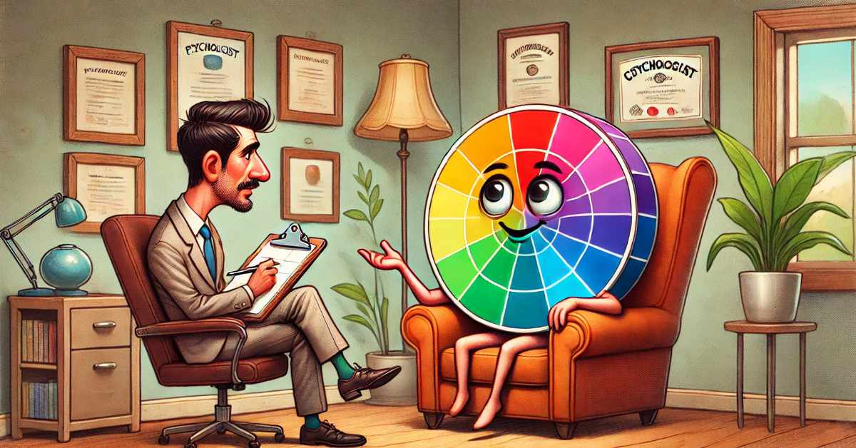
The Power of Colour: How Colour Psychology Can Shape Art, Design, and Branding

As I was working on one of my fluid art pieces in Procreate, I noticed the colours just weren’t appealing to me. The bland, neutral tones put me in a melancholic mood. These weren’t the colours I would normally choose, but they were part of an experiment inspired by the 1970 version of the movie “Wuthering Heights.” This experience reminded me how much colour in not only content and branding but also our own art and design work can impact mood.
Colour is one of the most powerful tools in art and design, capable of influencing emotions, conveying messages, and shaping perceptions. Whether you’re an artist, designer, or brand strategist, understanding colour psychology can help you make intentional choices that resonate with your audience and reinforce the messages you want to communicate. In this post, we’ll explore the role of colour psychology in art and design, and how brand and advertising colour choices can affect the mood and behavior of your audience.
The Basics of Colour Psychology
Colour psychology is the study of how colours influence human behavior and emotions. Different colours can evoke different feelings and reactions, which is why choosing the right colour palette is crucial in both art and design. Here’s a quick overview of some common colour associations:
- Red: Often associated with energy, passion, and urgency. It can create a sense of excitement but can also evoke feelings of danger or aggression.
- Blue: Known for its calming and trustworthy qualities. Blue often represents stability and reliability, making it a popular choice for corporate branding.
- Yellow: Associated with happiness, optimism, and warmth. However, it can also be overwhelming if overused, leading to feelings of anxiety.
- Green: Symbolizes nature, growth, and harmony. It’s often used to convey freshness and environmental consciousness.
- Purple: Represents luxury, creativity, and spirituality. It’s a colour that can add a touch of sophistication or mystery.
- Black: Often associated with power, elegance, and sophistication. However, it can also evoke feelings of sadness or negativity.
- White: Symbolizes purity, simplicity, and cleanliness. It’s often used in minimalist designs but can also feel cold or sterile.
Colour Psychology in Art
Artists have long used colour to evoke emotions and convey meaning in their work. For example, the use of cool blues and greens can create a serene, tranquil atmosphere, while warm reds and oranges can inject energy and intensity into a piece. Artists like Van Gogh and Monet have demonstrated how the strategic use of colour can transform a scene or evoke a specific mood.
When creating art, consider the emotional response you want to elicit from your audience. Are you looking to soothe or excite, comfort or challenge? Your colour choices can significantly impact how your artwork is perceived and what it communicates.
Colour Psychology in Design
In design, colour plays a vital role in shaping the user experience. Whether it’s web design, interior design, or product design, the colours you choose can affect how users interact with your creations.
For instance, a website with a predominantly blue and white color scheme may feel more professional and trustworthy, while a site with bright, bold colours like red and yellow may feel more dynamic and playful. Interior designers use colour to influence mood within a space; for example, soft blues and greens might be chosen for a spa to create a relaxing atmosphere, while vibrant reds and yellows might be used in a fast-food restaurant to stimulate appetite and quicken turnover.
The Impact of Colour in Branding and Advertising
Colour is a critical element in branding and advertising, often becoming synonymous with the brand itself. Think of Coca-Cola’s iconic red, McDonald’s golden arches, or the calming blue of Facebook. These colours are not chosen randomly; they are carefully selected to evoke specific emotions and create brand recognition.
Creating Brand Identity: A brand’s colour palette helps establish its identity. For example, a luxury brand might choose black and gold to convey elegance and exclusivity, while a tech company might opt for blue and silver to communicate innovation and reliability.
Influencing Consumer Behavior: The colours used in advertising can influence consumer behavior. For example, red can create a sense of urgency, making it effective for clearance sales or limited-time offers. Green, on the other hand, might be used in ads promoting eco-friendly products, as it reinforces the association with nature and sustainability.
Communicating Messages: Colours can also be used to communicate specific messages. For example, a charity organization might use blue to convey trust and compassion, while a health brand might use green to suggest wellness and vitality.
Tips for Using Colour in Your Work
Know Your Audience: Consider the cultural and emotional associations your audience may have with certain colours. Colour perceptions can vary widely across different cultures and demographics.
Be Consistent: In branding, consistency is key. Use your chosen colour palette across all marketing materials to create a cohesive and recognizable brand identity.
Test and Refine: Don’t be afraid to experiment with different colour combinations and see how your audience responds. A/B testing can be a valuable tool in finding the most effective colour choices for your designs or advertisements.
Balance and Contrast: Use contrast to make important elements stand out, but be mindful of balance to avoid overwhelming your audience.
Bringing It All Together
Colour is a fundamental aspect of both art and design, with the power to influence emotions, communicate messages, and shape perceptions. Whether you’re creating a painting, designing a website, or building a brand, understanding colour psychology can help you make choices that resonate with your audience and reinforce your intended message. By thoughtfully applying colour, you can enhance the impact of your work and connect with your audience on a deeper level.


0 Comments