October 2025 Colour Trends: Fresh Inspiration for Artists and Designers

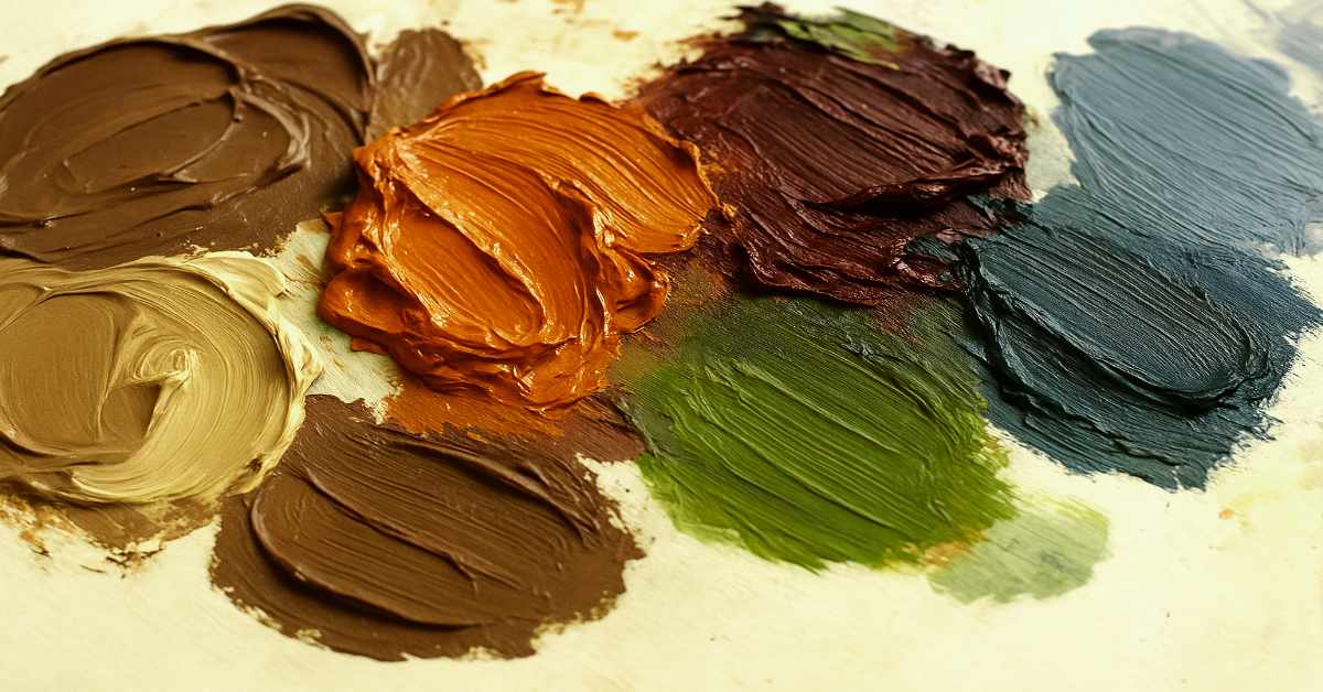
Colour trends are constantly evolving, and October 2025 is no exception. As the seasons shift toward deeper tones and cozy textures, this month’s palettes blend earthy warmth with unexpected vibrancy — perfect for painting, designing, or reimagining your digital workspace.
Whether you’re a traditional painter, digital artist, or designer building your next project, these colour trends are meant to inspire, not restrict. Think of this as your creative guide — a place to start experimenting and discovering what resonates with your own unique style.
Warm & Grounded Neutrals
One of the strongest directions this season is toward rich, natural browns. According to Wunderlabel’s 2025 Colour Forecast, “Mocha Mousse” is set to be a defining neutral for the year — a warm, slightly red-tinged brown that feels both grounded and sophisticated.
Similarly, Marie Claire’s Fall 2025 colour report spotlights dark chocolate tones as the new “luxe neutral.” These work beautifully as base hues in compositions or layered beneath cooler tones like slate blue or smoky grey.
Try this:
Mix a deep umber with a touch of crimson for a handmade Mocha Mousse tone.
Use these browns as backgrounds in digital work or underpainting layers in traditional art.
Spiced Orange & Burnt Gold
October wouldn’t be complete without a touch of orange — but this year’s trend leans more toward spiced pumpkin and copper than bright tangerine. These warm hues show up across fashion runways and design palettes, from Marie Claire’s seasonal picks to Pantone’s Autumn/Winter 2025–26 Fashion Report.
These tones instantly add warmth and energy — great for expressive brushwork or accent details in graphic design.
Try this:
Combine burnt orange with mocha for a cozy autumn feel.
Layer metallic gold or ochre highlights for a dimensional glow.
Deep Reds & Purples
Bold, confident hues are taking center stage this fall. From chili red to burgundy and wine, these colours convey intensity and emotion — perfect for statement pieces or bold contrast.
Glamour’s 2025 colour insights note that purples like plum and eggplant are making a strong comeback, often paired with earthy neutrals or even moss green.
Try this:
Use burgundy as your primary focal point and balance it with creamy taupe.
Experiment with purple shadows to create moodier depth in your art.
Natural Greens & Citrusy Accents
This season also welcomes a mix of organic greens — fern, olive, and even chartreuse. These hues echo nature and balance out the warmer fall tones. According to Byrdie’s Fall 2025 trend roundup, citrus-green and dill tones are surfacing as unexpected statement colours.
In art and design, these can be great for emphasizing freshness or contrast — especially when used sparingly alongside earthier hues.
Try this:
Add a brush of chartreuse to wake up a muted composition.
Use olive or fern as grounding background colours.
Cool Blues & Soft Neutrals
While autumn leans warm, cooler tones like slate blue, steel grey, and icy blue provide balance. Vogue’s Fall/Winter 2025 forecast highlights these blues as modern neutrals — elegant, calming, and versatile across mediums.
Soft creams and taupes continue to serve as essential counterpoints, allowing bold hues to shine.
Try this:
Use slate blue in your typography or sketch outlines.
Pair icy blue with mocha or pumpkin for a striking cool-warm interplay.
Play, Experiment, and Make It Yours
Remember — colour trends are just a starting point, not a rulebook. The beauty of art and design lies in experimentation. Whether you’re painting with acrylics, layering Procreate textures, or designing a fall-inspired pattern collection, let curiosity lead the way.
Think of these palettes as creative companions for the season — guiding you, but never defining you. Mix unexpected shades, test new combinations, and see where they take you.
Suggested October 2025 Palette

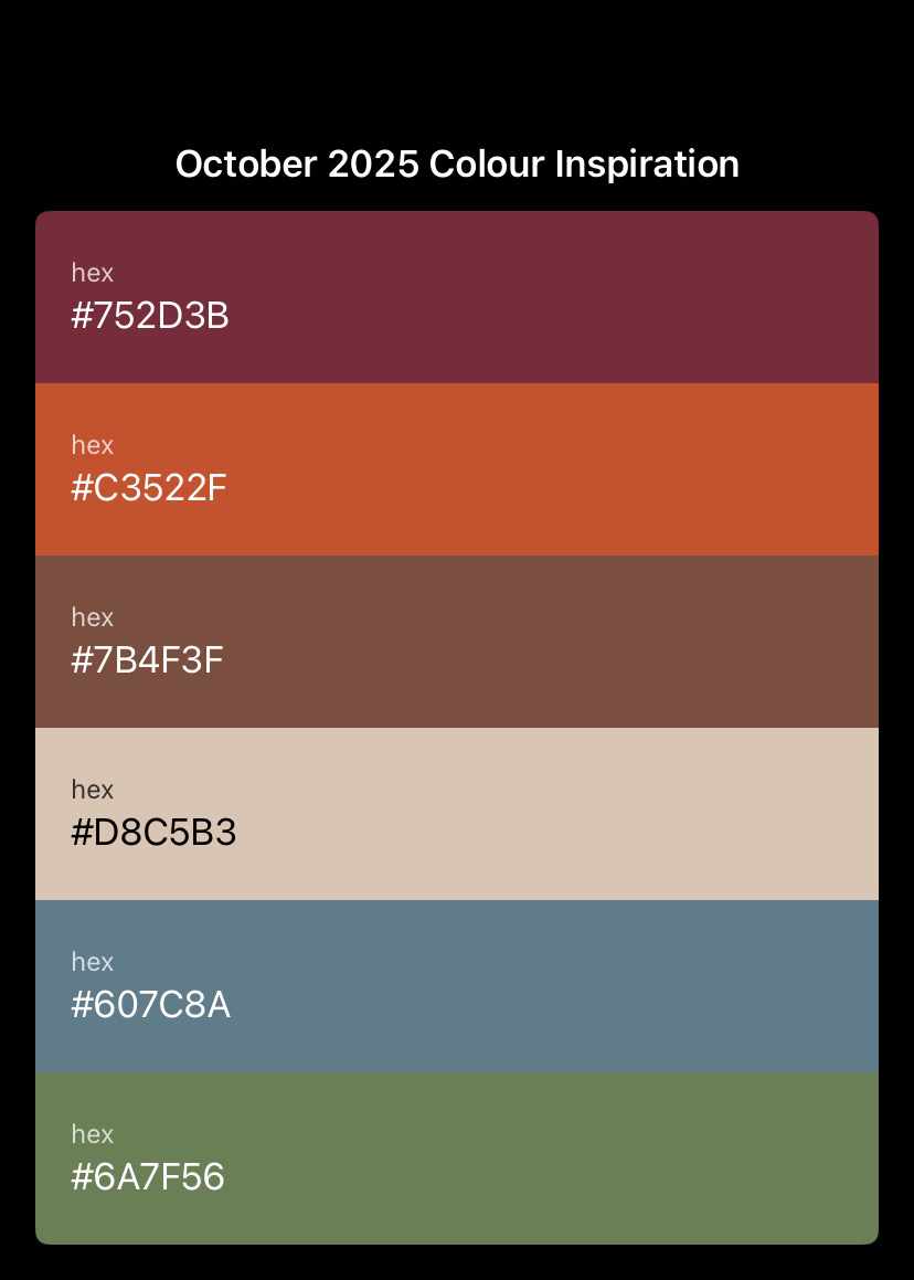
Below are the main shades highlighted this month, each followed by a hex code — the six-digit colour reference used in digital art and web design. If you’re working in Procreate, Photoshop, Canva, or similar apps, you can copy and paste these codes to match each shade precisely.
For traditional artists (or digital painters who love to mix colours visually), I’ve also added a few ideas on how to approximate each tone using basic pigments or digital brush blending.
Mocha Mousse – #7B4F3F
→ Mix burnt umber + a touch of crimson or red oxide for a warm, grounded brown.Spiced Orange – #C3522F
→ Try cadmium orange + raw sienna + a hint of white for that cozy autumn spice.Burgundy Red – #752D3B
→ Combine alizarin crimson + ultramarine blue + a bit of burnt sienna for depth.Fern Green – #6A7F56
→ Blend sap green + yellow ochre + a small amount of black or burnt umber.Slate Blue – #607C8A
→ Mix ultramarine blue + a little black + white for a cool, moody neutral.Cream Taupe – #D8C5B3
→ Combine titanium white + yellow ochre + a tiny bit of raw umber for softness.

If You Create Something Inspired by this Post, I’d Love to See it!
Share your work on Instagram or Threads using #artdesignbytc — whether you’re painting, sketching, designing, or experimenting with digital tools. Let’s celebrate how differently colour speaks to each of us. I’m always happy to share tagged posts!


0 Comments