Home > Blog > Colour Inspiration > 5 Colour Palettes for September Creativity

From Golden Hour to Wine Red: 5 Fresh September Colour Palettes for Artists & Designers

A digital graphic featuring a palette of 15 color swatches arranged in three tilted columns. Each swatch is labeled with its hexadecimal color code. The central text "September 2025" appears in a large, white cursive font over a semi-transparent black band across the middle.
A few highlights from the palettes in this post. There are full examples with hex codes below!

As the seasons begin to shift, September always feels like a fresh start—school is back, fashion weeks roll out, and nature begins its slow transition into autumn. For artists and designers, it’s the perfect moment to explore new colour palettes that balance late-summer warmth with early-fall depth.

Below are a few curated palettes you can draw from, whether you’re painting, designing digital graphics, or refreshing your wearable art.

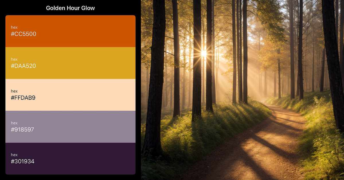
1. Golden Hour Glow

Think of September sunsets: glowing oranges fading into soft purples.

  • Burnt Orange (#CC5500)

  • Goldenrod (#DAA520)

  • Peach Beige (#FFDAB9)

  • Mauve Grey (#918597)

  • Midnight Plum (#301934)

Great for: warm, nostalgic illustrations or textile patterns that bridge summer and fall.

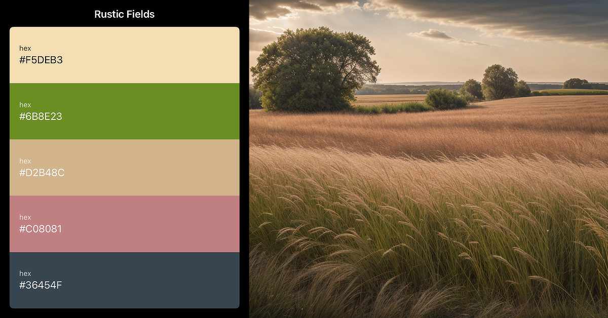
2. Rustic Fields

A digital graphic titled "Rustic Fields" displays a five-color palette on the left and a scenic rural landscape on the right. The palette includes vertically stacked swatches labeled with hexadecimal color codes: #F5DEB3 – wheat beige #6B8E23 – olive green #D2B48C – tan #C08081 – muted rose #36454F – dark slate gray On the right, the photo shows a wide field of tall, golden grass gently swaying under a partly cloudy sky. Clusters of large, leafy trees are scattered across the landscape, and distant farmlands stretch toward the horizon. The lighting suggests late afternoon or early evening, giving the scene a warm, earthy tone.

Inspired by harvested wheat, dried grasses, and earth.

  • Wheat (#F5DEB3)

  • Olive Drab (#6B8E23)

  • Warm Taupe (#D2B48C)

  • Dusty Rose (#C08081)

  • Charcoal (#36454F)

Great for: earthy print designs, branding, and grounded neutrals in collage work.

3. Coastal September

A digital graphic titled "Coastal September" shows a five-color palette on the left and a scenic ocean view on the right. The palette features vertically stacked swatches, each labeled with a hexadecimal color code: #9FE2BE – soft mint green #87CEEB – sky blue #E4CDA7 – light sand beige #6A5ACD – medium periwinkle #001F3F – deep navy blue The right side features a dynamic photo of waves crashing onto a sandy beach under a pink and lavender-tinged sky. The foamy surf creates white patterns across the dark wet sand. The lighting suggests early morning or late evening, adding a calm yet vivid mood to the seascape.

Not everyone is ready to let summer go—this palette channels seaside calm.

  • Seafoam Green (#9FE2BF)

  • Sky Blue (#87CEEB)

  • Soft Sand (#E4CDA7)

  • Slate Blue (#6A5ACD)

  • Deep Navy (#001F3F)

Great for: fluid art, digital abstract backgrounds, and wearable art with a coastal vibe.

4. Wine & Orchard

A digital graphic titled "Wine and Orchard" features a five-color palette on the left and a photograph of ripe grapes on the right. The palette consists of vertical color swatches labeled with hexadecimal codes: #722F37 – dark wine red #582534 – deep plum #8DB600 – vibrant yellow-green #DE5D83 – medium raspberry pink #FAF3DD – soft cream The photo on the right shows clusters of red and purple grapes hanging from a vine, with large green leaves above. The grapes are bathed in sunlight, creating rich highlights and shadows against a blurred green orchard background.

September is harvest season, full of grapes, apples, and figs.

  • Wine Red (#722F37)

  • Fig Purple (#582534)

  • Apple Green (#8DB600)

  • Warm Blush (#DE5D83)

  • Pale Cream (#FAF3DD)

Great for: bold graphic patterns and statement prints with richness.

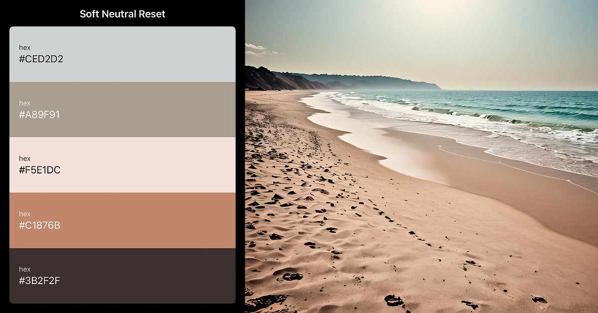
5. Soft Neutrals Reset

Minimal palettes are trending for fall fashion—here’s a calming take.

  • Mist Grey (#CED2D2)

  • Stone (#A89F91)

  • Pale Blush (#F5E1DC)

  • Warm Clay (#C1876B)

  • Black Coffee (#3B2F2F)

Great for: clean graphic design projects, minimalist illustration, and web layouts.

How to Use These Palettes

  • In Digital Art: Drop HEX codes into Procreate or Photoshop swatches.

  • In Traditional Work: Mix pigments to approximate tones (e.g., Burnt Sienna + Yellow Ochre = Goldenrod).

  • In Design Projects: Use as a starting point for branding, fashion sketches, or website accents.

Colour has the power to set the tone of your work—so let these palettes inspire fresh ideas this month.

References & Further Reading

More From Art and Design By Teresa Cowley
A still life of red roses and candles. The power and passion of favourite colour red.
The Passionate Power of Red: Favourite Colour
Embark on a journey through the 'Secrets of Red' in my Favourite Colours series. Discover what your love...
jack-o'-lanterns showing off the orange of Halloween
Orange: Your Personality and Halloween's Colour
Ever wondered what your love for orange says about you? Uncover the secrets of your personality and dive...
The image features two hands shaking, outlined in white with simple, sketch-like lines. The texture within the hands consists of a mosaic-like pattern, with small, pebble-like shapes in varying shades of black and gray. The background is a swirling blend of earthy and muted colors, including greens, purples, and browns, creating a fluid, abstract effect. The name "T. Cowley" is signed in white script in the bottom right corner. The overall composition gives a sense of unity and connection against a dynamic, colorful backdrop.
Open for Creative Collaborations!
Looking to team up on something creative? As a digital artist and designer, I’m open to collaborations!...

Digital artist and graphic designer, Teresa Cowley

My name is Teresa Cowley, and I'm a digital artist and graphic designer from Vancouver Island, Canada. I focus on abstract and fantasy art as well as digital collage, and like to utilize AI art tools as part of my design process to create new, innovative pieces of art. I strive to create new, unique designs that tell imaginative stories, and I am eager to push the boundaries of what can be expressed with art and technology.

0 Comments

Leave a Reply

Avatar placeholder

Your email address will not be published. Required fields are marked *