Fear in Art: How to Create Emotionally Charged Art for Halloween and Beyond

Happy Halloween! As the air turns crisp and pumpkins dot doorsteps, it’s the perfect time to dive into the dark side of art: fear. Halloween may be the official season of spookiness, but fear is a powerful emotion that resonates all year round—especially for fans of the horror genre. In this post, I’m exploring how fear can be felt through art and design. Whether you’re crafting Halloween-inspired pieces or working on a horror-themed project, mastering the art of suspense and fear in your visuals is essential. Let’s take a closer look at the psychology behind fear and how we can use it to create emotionally charged artwork.
The Power of Color Psychology in Evoking Fear
One of the most effective ways to trigger fear or suspense in your art is through colour. As we know, colours are more than just visual elements—they carry psychological weight. When used thoughtfully, they can instantly set the mood of a piece and stir up specific emotions in the viewer.
For Halloween or horror art, dark tones like black, deep purples, and blood reds are classic go-tos. Black is an obvious choice for its association with the unknown, shadows, and mystery. It’s a colour that evokes a primal sense of fear, often representing death, danger, and the void. Pair it with dark, saturated reds, which can symbolize both passion and violence, and you’ve already set the groundwork for a chilling atmosphere.
However, unconventional colour palettes can add a unique twist to your artwork. Consider sickly greens, washed-out grays, or even pale, cold blues. These hues can evoke a sense of unease and sickness, playing into feelings of discomfort rather than outright terror. A pale green light, for example, might make a scene feel ghostly or otherworldly, while cold blues can represent isolation, like the eerie chill of a haunted space.
Composition: Building Tension through Space and Perspective
The layout of your artwork also plays a key role in evoking fear. Think about how horror movies create suspense—sometimes it’s what you don’t see that makes things truly terrifying. In your art, you can build tension by leaving empty spaces or by obscuring parts of your composition. This can cause a sense of unease, as the viewer’s mind fills in the blanks with imagined horrors.
Perspective is another powerful tool. A distorted or unusual angle can make a scene feel off-kilter and unnatural. Looking at something from a high angle might make the subject seem small and vulnerable, while a low angle can make a figure appear larger and more menacing. Playing with the viewer’s sense of control—or lack of it—through perspective is key in creating fear.
Textures and Details: Creating Discomfort

To enhance the emotional impact of your art, focus on the small details. Adding texture can create a visceral reaction in the viewer, triggering feelings of discomfort. A surface that looks too rough or too smooth, or that suggests decay or rot, can make people squirm in their seats. This is especially effective in horror art where you want to evoke physical unease.
Grunge effects, scratches, or glitching elements can make your artwork feel chaotic or corrupted. These imperfections play into the fear of things not being quite right or slipping out of control, both common horror themes. Digital artists, this is where Procreate, Rebelle or any other tools you use can really shine! Play with brush settings to create textures that feel unsettling—whether it’s a slimy creature or a weathered, eerie background.
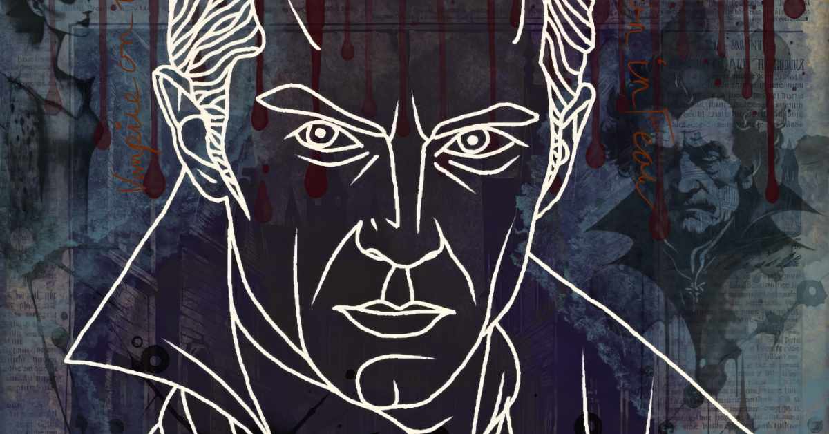
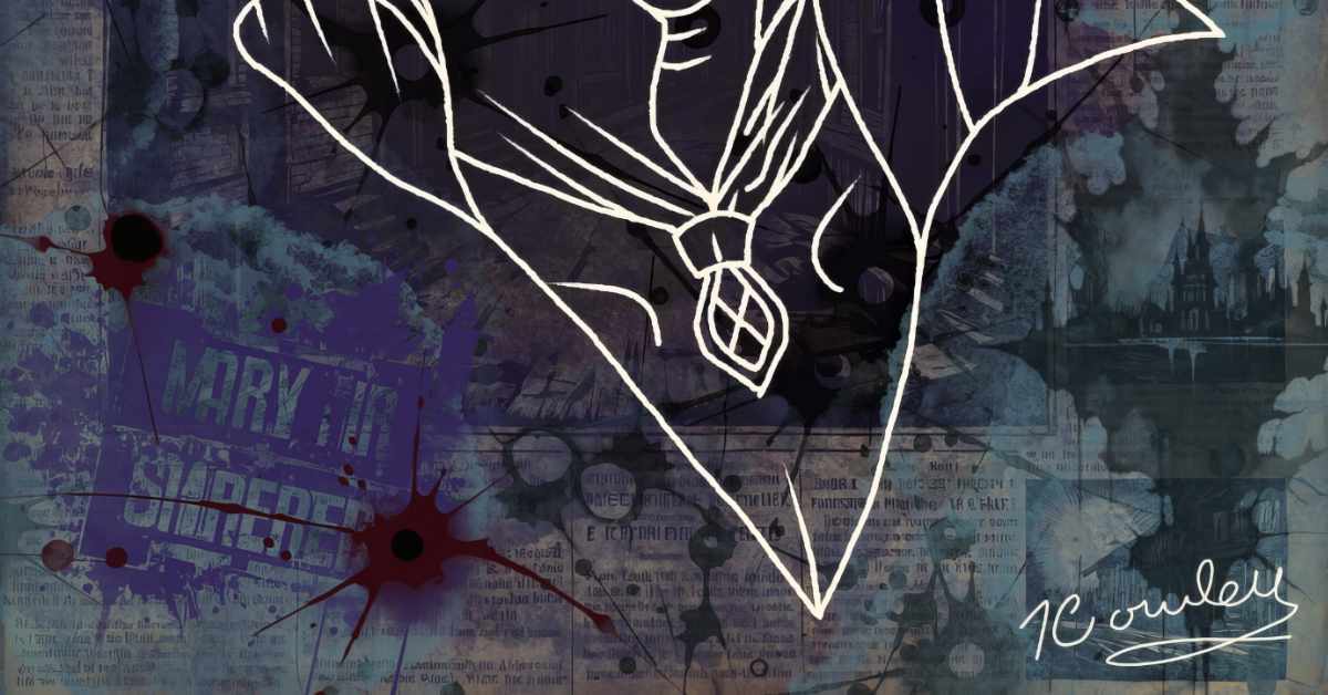
Watch the Procreate Time-Lapse Video of Me Creating My Vampire Portrait Below:
Symbolism: Tapping into Archetypes of Fear
Fear in art isn’t just about mood or texture. Sometimes it’s the subject matter itself that taps into deep, primal fears. Throughout history, certain symbols and imagery have been used to communicate fear across cultures. Skulls, bats, and spider webs are classic Halloween symbols that convey death and danger, but you can take it deeper.
Animals like snakes or crows, objects like broken mirrors, or even more abstract elements like long, twisted shadows can all evoke fear. These symbols can trigger a psychological response in the viewer because they tap into universal archetypes of fear. Incorporating them into your art helps create that emotionally charged connection, which is what makes horror so powerful.
Creating Suspense Through Light and Shadow
Fear thrives in the unknown, and nothing evokes the unknown quite like shadow. Chiaroscuro—the dramatic use of light and shadow—has been used for centuries to create suspense and drama in art. High contrast between light and dark can make certain elements in your composition pop, while also hiding others in shadow. It’s the hint of what could be lurking in the darkness that keeps viewers on edge.
In digital art, playing with layering effects and gradients can add this depth of light and shadow. Whether you’re using digital tools like Procreate or more traditional methods, think about where the light is coming from and what it leaves behind. An under-lit figure can become instantly menacing, while flickering candlelight might hint at danger lurking just out of sight.
Bringing It All Together: A Simple Case Study in Fearful Art
Let’s say you’re designing a Halloween-themed piece featuring a haunted house. You could start by setting the tone with a dark, moody palette—black and crimson, perhaps. Then, think about composition. Maybe the house is barely visible, its form obscured by thick fog, leaving part of the scene to the viewer’s imagination. You could add in subtle textures—broken windows or a peeling, decayed door to heighten the discomfort. Finally, through the clever use of light, you cast long, dark shadows across the ground, with only a faint glow emanating from a single, cracked window. You’ve just created a visual that not only depicts fear, but makes the viewer feel it.
Making Fear Your Artistic Ally
Fear is one of the strongest emotions an artist can evoke, especially in horror or Halloween-themed art. Whether you’re working with colour psychology, playing with texture, or using light to hide unsettling details, the key to creating emotionally charged artwork lies in how you guide the viewer’s emotions. As you work on your next piece, keep these techniques in mind. You’ll be able to transform a simple concept into something that leaves a lasting, chilling impression—just in time for Halloween.


0 Comments