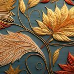
Boost your creative projects with a dive into the latest surface pattern trends for Fall 2023, handpicked...

The mix of urban culture and digital art is inspiring a new wave of creativity in surface pattern design...
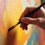
Feeling stuck at the starting line with your art? This post is a warm, down-to-earth pep talk for beginner...


0 Comments