
Explore the future of digital art with the latest tools, emerging tech, and vibrant communities. Dive...

Dive into the mesmerizing world of the Floating Glass Museum in my latest blog post! Discover how this...
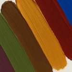
November’s colour trends bring bold blues, moody reds, and cozy earth tones into the spotlight — perfect...


0 Comments